Client
Get Cover.
5 Months
5 Months
2026
2026
Build an insurance app but make it fun? We got this.
Insurance isn’t exactly known for being exciting. That’s what made this project so interesting. Get Cover hired us to design and develop a mobile app built specifically to engage a younger audience, in an industry that traditionally struggles to connect with them. We brought energy, clarity, and a modern user experience to device protection, making it simple, intuitive, and actually enjoyable to use. Beyond the mobile experience, we also built a comprehensive web portal that enables parents to secure coverage for devices distributed through their school districts, creating a seamless ecosystem across mobile and web.
The Challenge We Solve
Life can be stressful when you're not insured Many young people are choosing to go without insurance, but this is leaving them exposed and adding to the financial pressures and anxiety in their lives.

Brand Behaviours
These principles guide how we act, speak, and serve—ensuring that every interaction reflects our purpose and builds trust with our customers.
Explain the Ups and Downs
We explain the risks and rewards of life with and without insurance.
We remove the confusion around insurance by speaking directly and providing complete clarity.
We do everything we can to make the process of being insured easier, more accurate and affordable.
Be Ultra Responsive
We adapt our service to the needs and lifestyle of our members.
We keep our members safe along the way with proactive notifications and useful services, so they avoid unexpected surprises.
When they need us, for any reason, we spring into action to provide support.
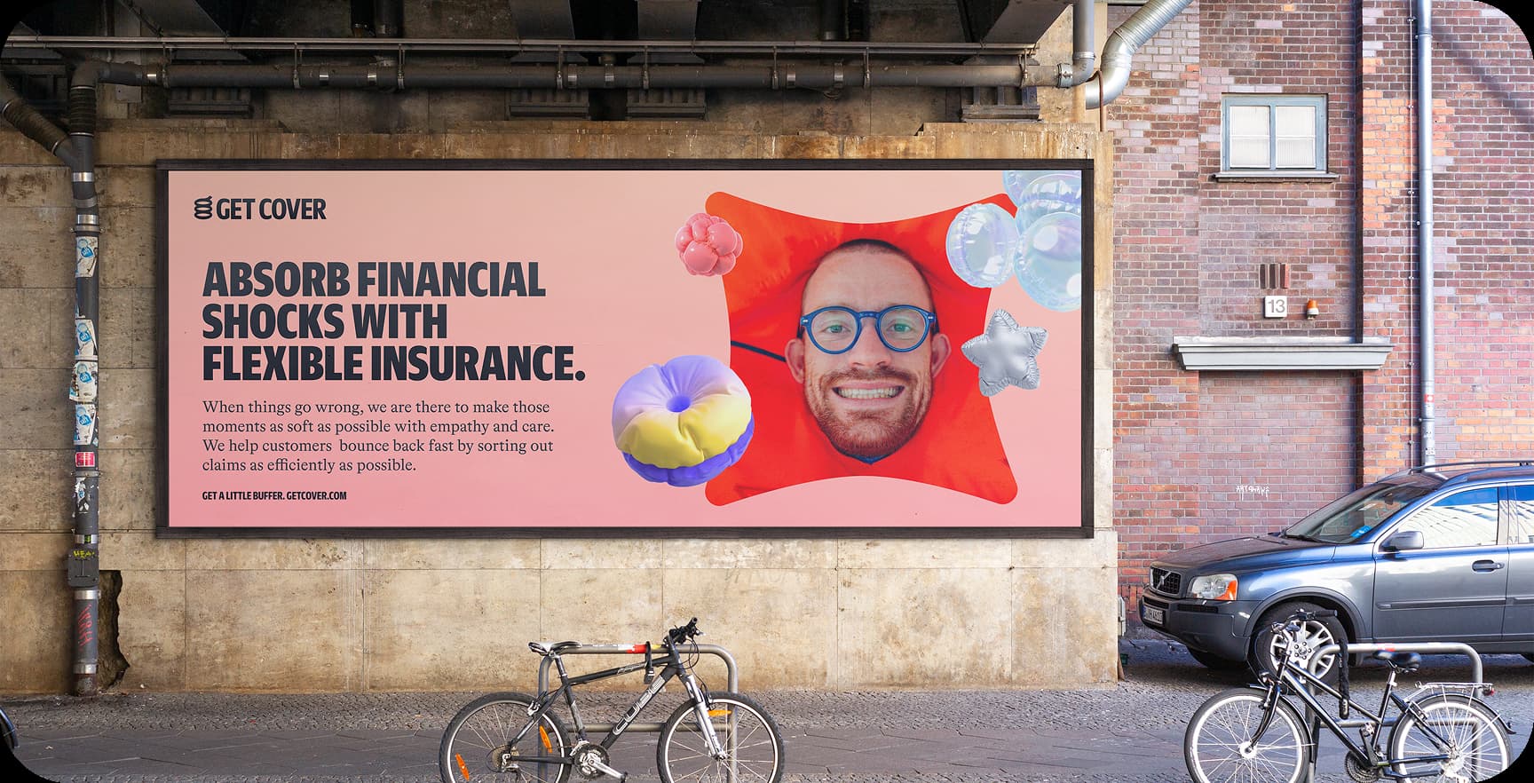
Absorb the
Shock
We make the process of getting insurance as smooth and stress free as possible.
We help customers to choose the right solutions so they have just the right amount of protection.
When things go wrong, we are there to make those moments as soft as possible with empathy and care.

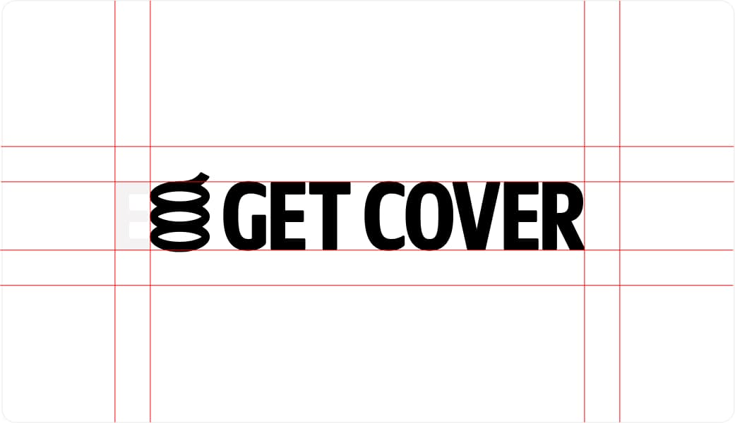
logo
The logo is a key part of the brand’s identity. Its consistent use across all materials helps maintain recognition and coherence.
Wordmark – Rationale
Set in bold, condensed caps, the wordmark aims to communicate safety and confidence. While the message is strong, the softened letterforms balance it out—suggesting reliability and approachability, in line with the brand’s promise of value and protection.
Symbol – Rationale
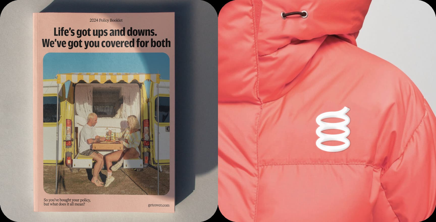
The symbol represents the idea of absorbing life’s unexpected shocks. It’s designed as a spring—a visual metaphor for resilience, elasticity, and cushioning impact.
In motion, it stretches and bounces, reinforcing the brand’s playful tone. Typographically, it also echoes the shape of a lowercase “g”, with the spring extending from the ear of the letter—adding meaning to form.
Symbol – Construction
The symbol is built using overlapping rings that create a sense of depth and dimension. The overlapping forms simulate a coiled spring, adding motion and elasticity to the visual identity.

Symbol – Safe space
Adequate padding should be maintained around the symbol to ensure clarity and allow space for motion or bounce in animations.

Primary Logo
The primary logo is composed of the wordmark placed alongside the symbol in a fixed configuration.
Symbol – Safe space
Maintain clear space around the logo to ensure visibility and prevent visual clutter, following the defined padding guides.
Primary logo – Minimum size
The logo should remain legible at all times. Avoid scaling below 20 pixels in height and use discretion to ensure clarity across all sizes and applications.

Logo – Colour usage
The logo should primarily be used in black and white or with the peach gradient from the primary palette. Consistent colour use is essential to maintain brand integrity. Avoid applying colours outside the defined palette.

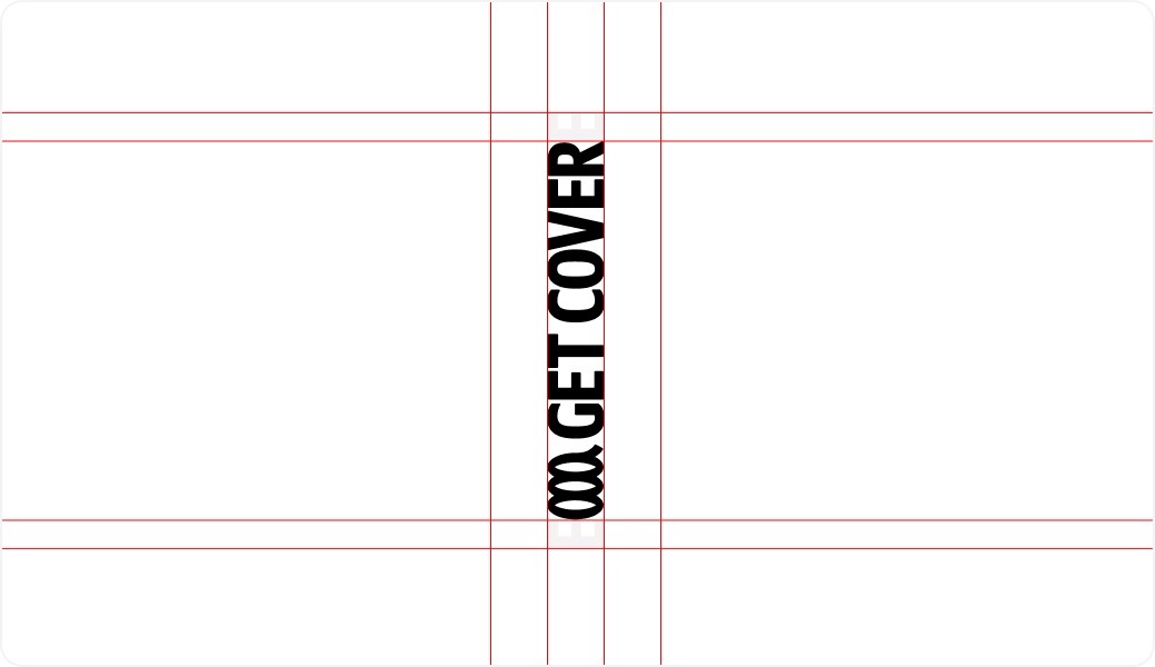
Vertical logo – Rationale
The vertical configuration allows the logo to sit on top of the spring, adding a playful bounce. This format is also useful when fitting the logo into narrow or edge-aligned spaces within a layout.
Vertical logo – Safe space
The vertical configuration allows the logo to sit on top of the spring, adding a playful bounce. This format is also useful when fitting the logo into narrow or edge-aligned spaces within a layout.
Logo – Placement
The logo can be positioned in the corners of any layout. The wordmark and symbol may be separated, as long as they remain centrally aligned.
When using the vertical version, it should be placed at the bottom edge so the spring visually supports the type above it.

Colour
Colour plays a key role in defining the brand’s personality. The palette was designed to reflect its energy and ambition, using bright and modern tones that align with the spirit of its audience.
This section outlines the colour usage guidelines developed to maintain visual consistency and recognisability across all applications. The palette is vibrant, playful, and adaptable—supporting a wide range of brand expressions while staying true to its identity.
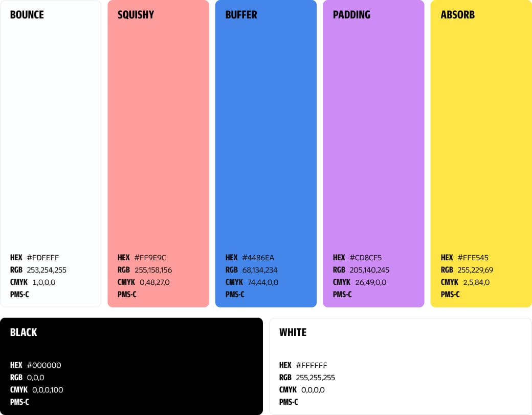
Colour palette – Primary
The brand’s primary palette features a range of bright, playful colours intended to attract attention—like wasps to ice cream on a sunny day.
Colour palette – Primary gradients
Gradients are used to add visual depth and energy to the brand. They are especially effective in large-scale elements like headlines. To maintain their impact, they should be used in big areas and applied sparingly.

Colour hierarchy – Light mode
In light mode, the goal is to maintain clarity and vibrancy without overwhelming the user. Large areas should use a bright or neutral primary colour, supported by accent tones to highlight important elements and guide attention.

Colour hierarchy – Dark mode
In dark mode, the priority is contrast and readability. Deep backgrounds should be combined with lighter tones for text and accents. Primary colours can be used more sparingly to create focus without compromising accessibility.

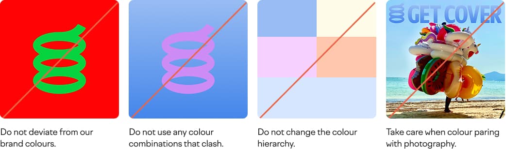
Do nots
Here are a few pointers to help you stay on track.
The most important thing to remember is to stick with our primary palette.
Typography
This project uses a distinct set of typefaces to create a unique and recognizable visual voice. The following section outlines the chosen fonts and their intended applications.
Type – Duplicate Sans Condensed
A condensed sans-serif available in multiple weights. It delivers strong visual impact, making it ideal for headlines and key messages where attention is needed.

Type – Romek Rounded
A rounded serif used for body copy and detailed content. It brings balance and a more grounded tone to the brand, supporting clarity and readability in longer text blocks.
Type – Hierarchy
Use Duplicate Sans for bold, high-impact headlines.
Romek Rounded is recommended for supporting body copy.
Duplicate Sans can also be used for smaller UI elements or technical details.

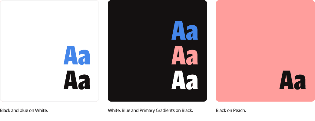
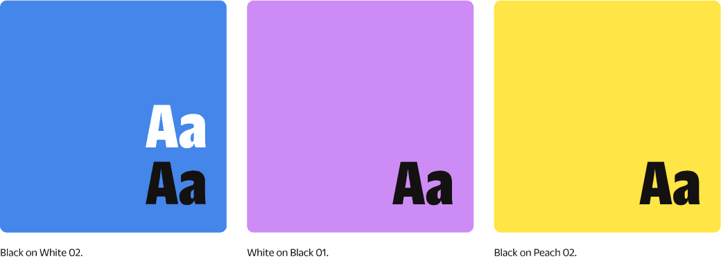
Type – Colour accessibility
To meet accessibility standards, ensure colour combinations meet at least AA or AAA contrast ratios. The following examples illustrate compliant pairings.
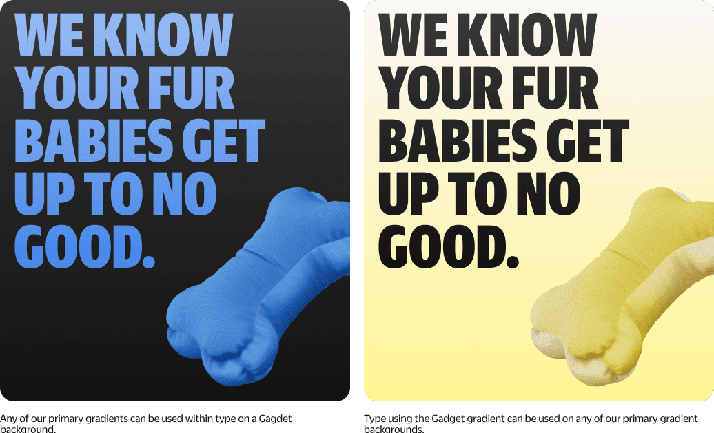
Type – Using gradients
Gradients can be used as a creative type treatment to add depth and dimension. It’s important to follow the visual rules to maintain legibility and colour accessibility across different applications.
Type – Image accessibility
Text should remain easy to read when placed over images. A subtle black overlay on photography can improve contrast and enhance readability.

Do nots
A few reminders to help maintain consistency:
Always take care when setting type.
For visual references, check the brand examples section of the guideline document.

Super graphics
These elements animate by inflating and deflating, creating soft, bouncy interactions that bring energy and motion to the overall experience.
Graphic containers
The super graphics extend the visual language and functional flexibility of the design system. They include a variety of shapes and 3D elements that can be used across different types of content. This section outlines how to apply them effectively based on context.
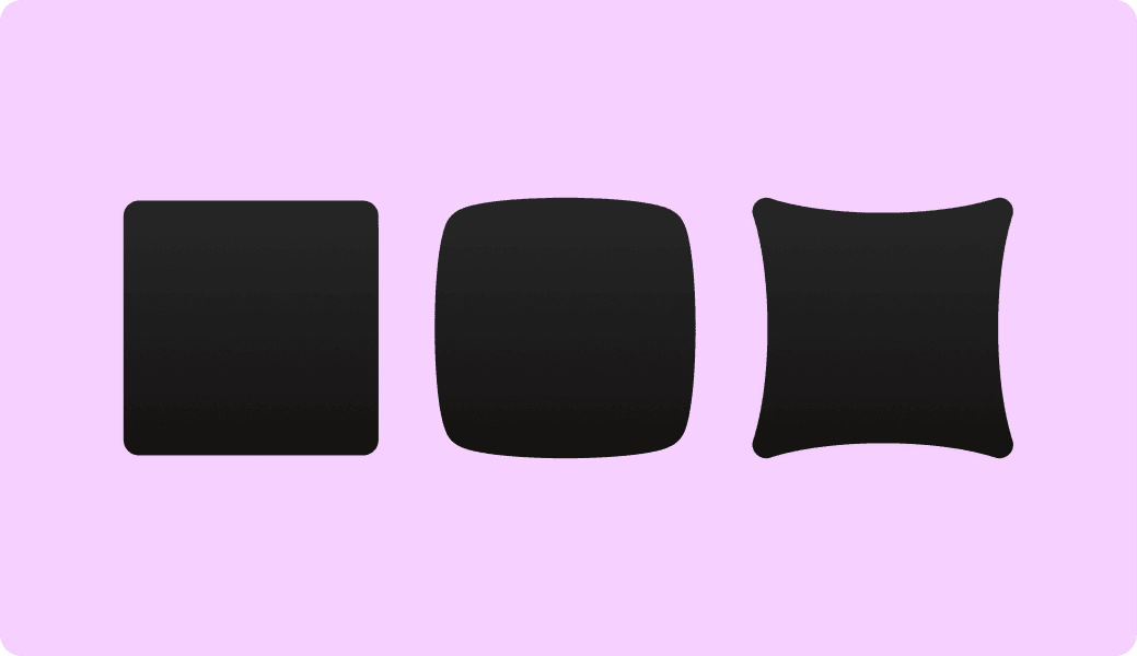
Graphic containers – In use
These containers feature exaggerated rounded corners to emphasize softness. There are three primary shapes used consistently throughout the brand system, especially visible in layouts for photography and typography.

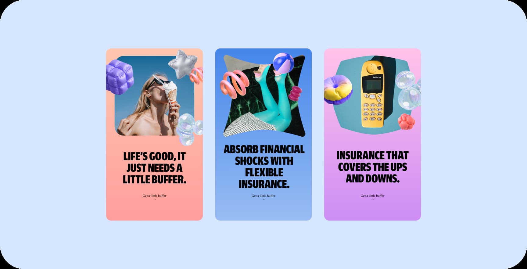
3d graphics – Overview
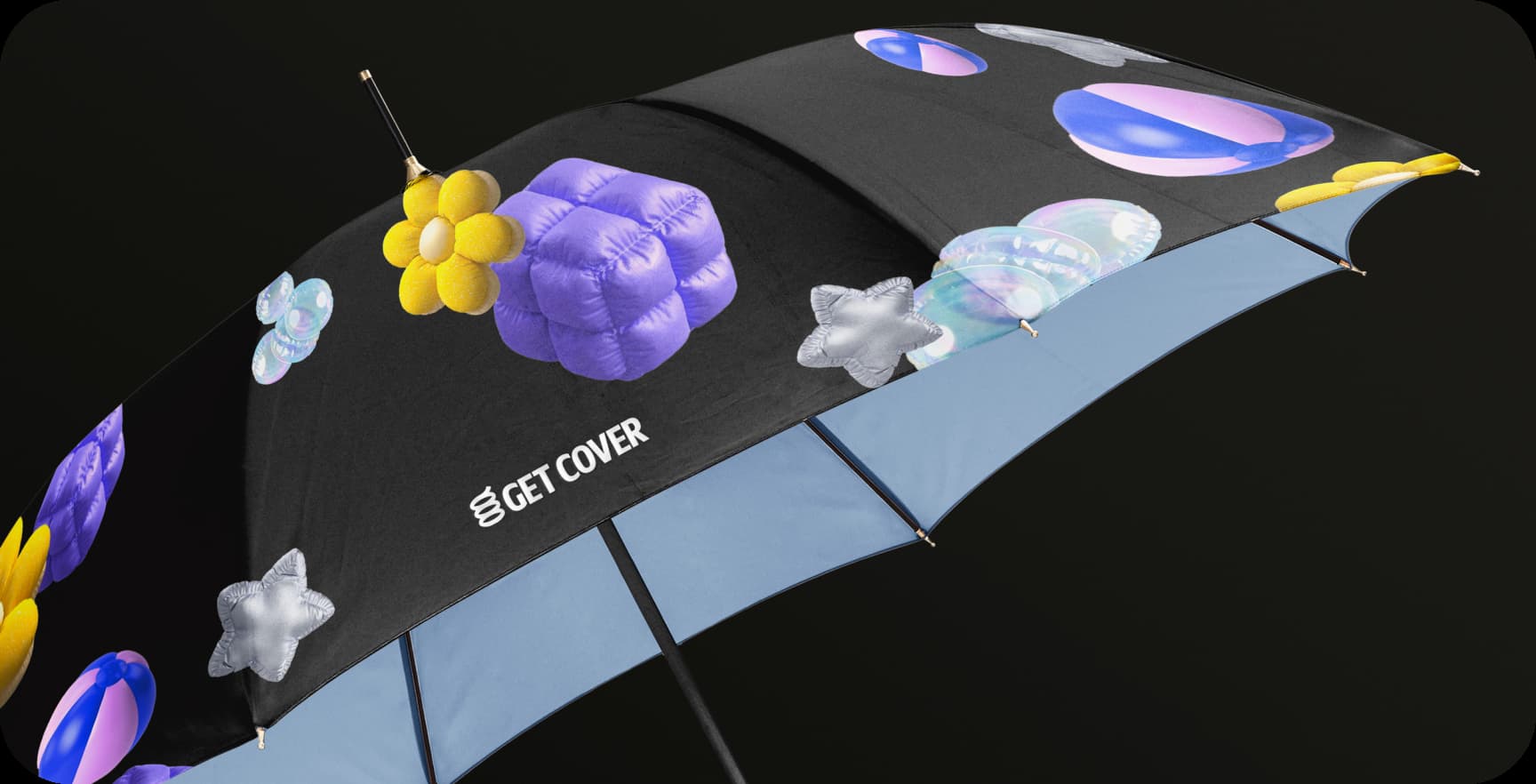
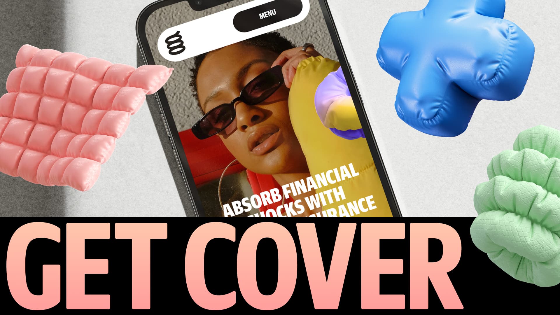
The 3D shapes function as visual shock absorbers. They reflect softness, bounce, and security—reinforcing the idea that the brand is here to help when things go wrong.

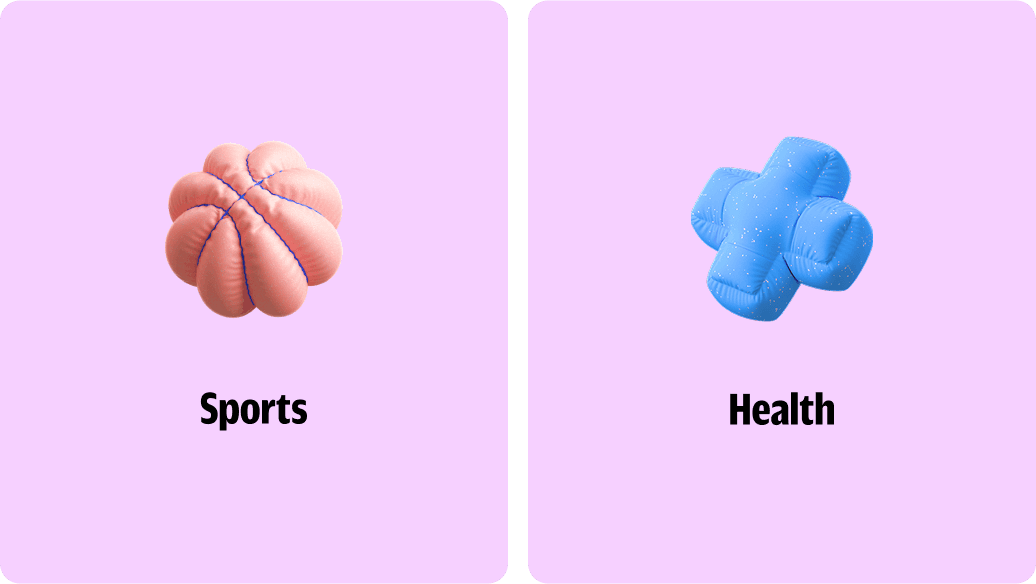
3d graphics – Styles
These squishy shapes, used with a sense of playfulness, help visually represent key product categories—for example, a dog bone for pet insurance or a beach ball for travel-related coverage.
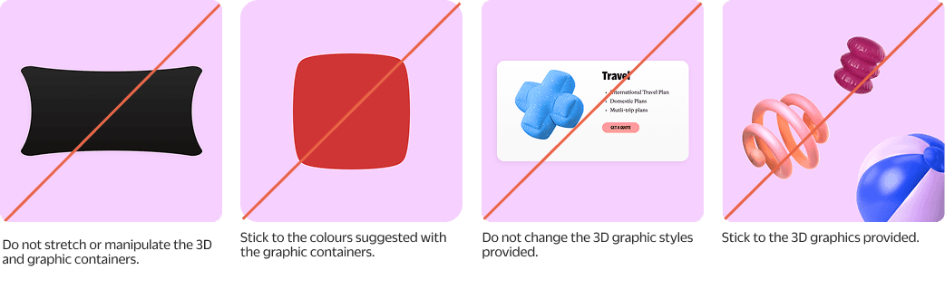
Do nots
A few key reminders to stay aligned with the intended visual tone. For more examples and inspiration, refer to the brand application section of this document.
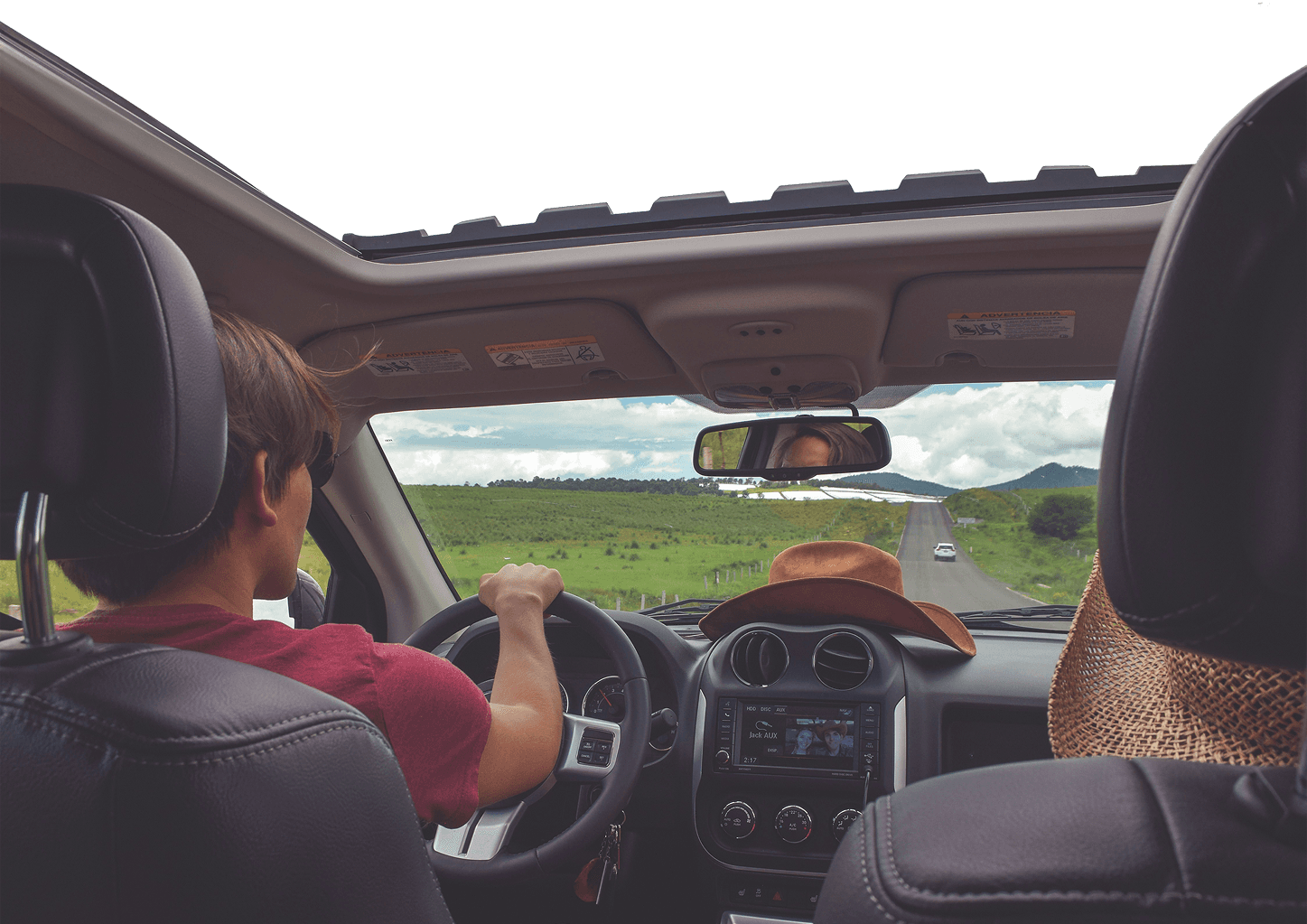
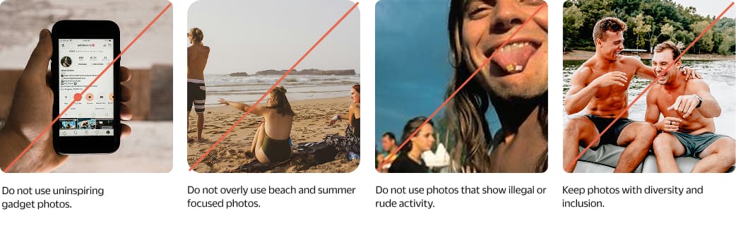
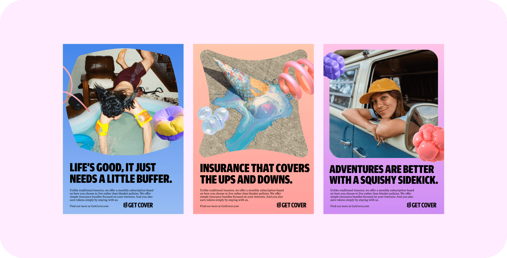
Photography
Photography is focused on representing real people—especially gen Z and younger millennials—highlighting their energy, personality, and lifestyle. This section explains how visuals are used across content categories and touchpoints.
Overview
The brand connects with young people by showcasing how they see and explore the world. Imagery includes everyday adventures, spontaneous moments, gadgets they use, and pets they care about.

Travel cover
Bright, joyful photos of young people traveling. These often include fun, lighthearted scenarios—like holidays, juggling ice creams, or holding balloons.

Pet cover
Focus is placed on pets and their emotional connection with their owners. The imagery should feel cute, silly, cuddly, and emotionally engaging—aiming to capture heartwarming, spontaneous moments.

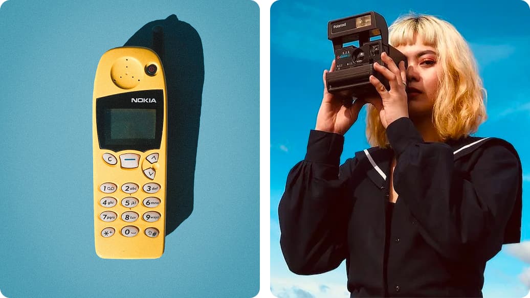
Gadget cover
This theme draws on nostalgia and a sense of protection—showing meaningful products in people’s lives. Use visuals of the items themselves and people actively interacting with them, evoking a retro-modern feel.
Festival cover
Capture vibrant, energetic scenes of festivals and celebrations. Emphasize people, movement, colour, and joy—showing how the brand connects to moments of fun and freedom.

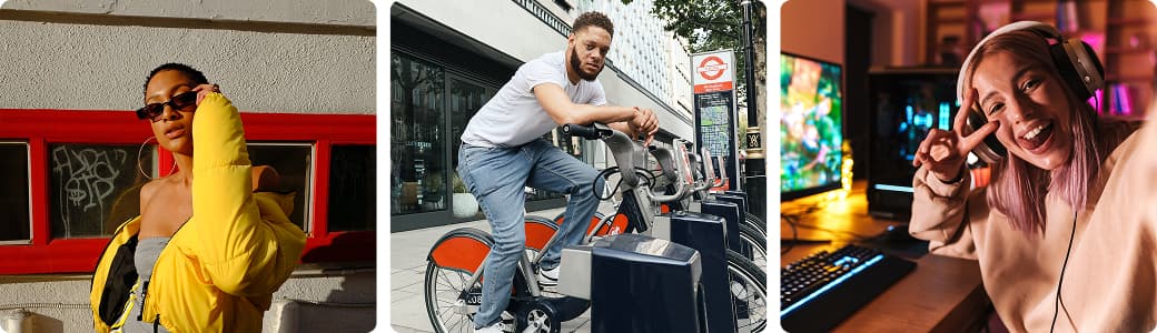
Personalised cover
Portraits should feel energetic and relatable, reflecting the diverse lifestyles and personalities of the audience. It’s okay to show some attitude—images don’t always need to be cheerful, though a smile is welcome when it feels natural.
Do nots
A few simple guidelines help keep the visual tone consistent. The key is to stay aligned with the brand’s energy and avoid clichés, forced expressions, or overly staged compositions.
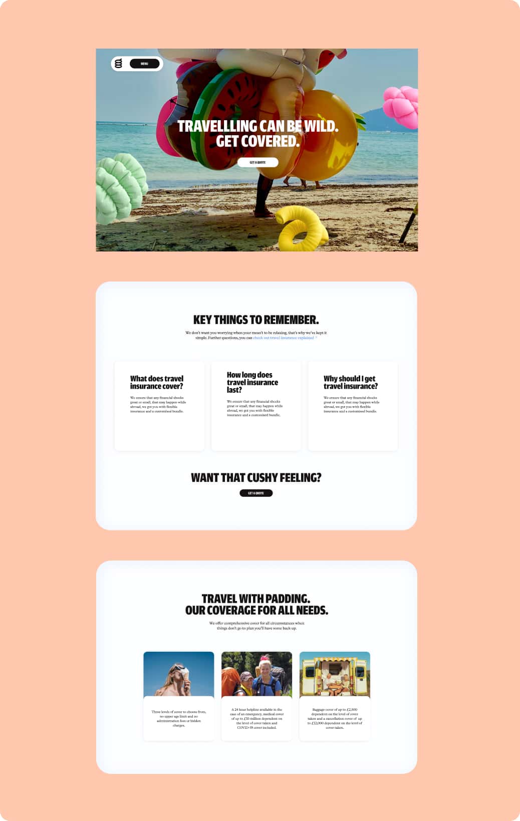
Layout
To reflect the visual language of “shock absorption,” the layout uses rounded containers and soft, squishy divisions to structure content. This section explains how these modules are applied to organize the brand’s system.
Layout construction – Grid
A 12-column grid is used for landscape layouts and an 8-column grid for portrait formats. Generous margins provide breathing room and reinforce the soft, open tone of the brand.

Layout construction – Portrait format
Use large images that fill the frame, with key typography centered in the middle. Rounded modules highlight important content while maintaining a soft, open visual tone. Keep things minimal and use shadows to add depth and warmth.

Layout construction – Landscape format
Large, full-width images paired with centered text ensure clarity and visual impact. Rounded corners and inner shadows enhance softness. Keep layouts simple and modular to support flexibility and ease of reading across screen sizes.
Do nots
Here are a few pointers to help you stay on track. The most important thing to remember is to…

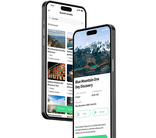
Digital
All design assets were provided in Figma for easy drag-and-drop into working files. Attention to small details was emphasized, as they have a significant impact on the overall experience.
Overview – Design details
Several design elements were defined to create a playful and cohesive digital experience. Consistent use of these details is key:
squishy construction
Elements are designed to feel bouncy and springy in both interaction and animation.floating panels
Panels sit above background layers to visually separate content. Soft, squishy objects can float in front or behind these panels.rounded edges
Modules feature pronounced rounded corners to create a soft and friendly effect.
Layout system
The layout starts with a large open background—black, white, or playful imagery—and is layered with oversized rounded modules. These modules interact with one another, compressing slightly to organize content and define sections.
Shapes are designed to behave responsively, with playful, squishy animations. When appropriate, inflatable-style interactions are added to enhance engagement.

Layering
When layering on dark or light backgrounds, use tints to create a sense of depth. The darkest layers should appear furthest back, while lighter panels are brought visually forward.

Light & Shadow
Soft drop shadows are used to visually lift elements placed above panels, helping define hierarchy and depth in the interface.

Grids
The responsive layout grid adapts to different screen sizes and orientations, ensuring consistency across all layouts.
Recommended settings:
desktop: 80px, 16-column grid, 20px gutter
mobile: 20px, 8-column grid, 4px gutter

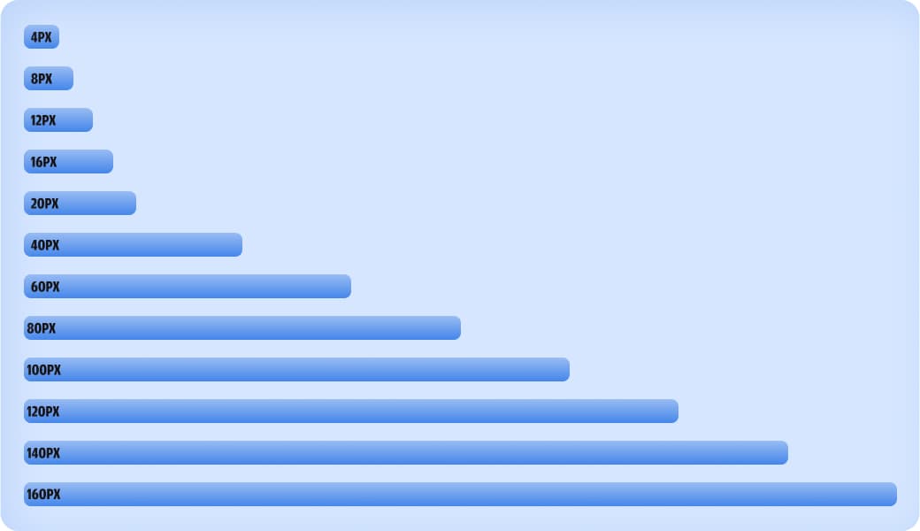
Spacing
A defined spacing system improves speed and consistency when designing. Scalable and limited spacing options reduce guesswork and support a more systematic workflow across design and development.
Buttons
Primary buttons use the core brand colours to ensure legibility across all background types. Usage should follow specific colour compliance guidelines.
Secondary buttons are outlined using the same core colours. All buttons feature rounded corners for a consistent and friendly appearance.

Component library
An extended component library was created to support flexibility, offering multiple variations of each UI element.
The full library is available through the link provided below.

Icons
These icons are selected for their clarity, scalability, and functional flexibility. They maintain visual consistency in terms of style, colour, and placement. Their role is purely practical—designed to support the interface where usability is essential.

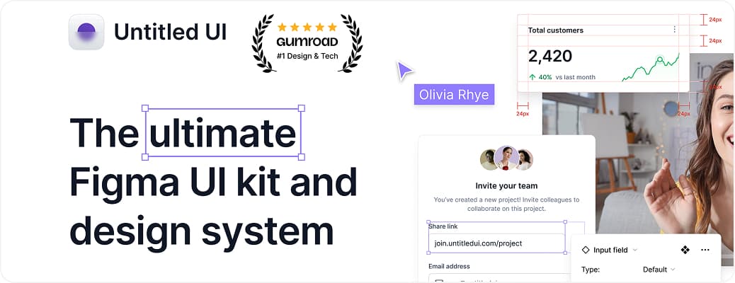
Additional cover – Untitled ui
For extended UI needs, Untitled UI also offers a full design system kit. Any additions or adaptations should follow the existing component library, matching the defined corner radius, spacing, and colour system to ensure alignment with the brand's visual language.
Do nots
General reminders to stay on track. The most important rule is to remain consistent with the core guidelines and use common sense when applying or extending UI elements.

Brand in application
This is where you can see all of the brand elements coming together on everything from shirts to social media posts.


We’re crafting an experience that’s squishy, smart, and smooth to use.
Very soon, you’ll hold Get Cover in your hand.
Continue Watching